
Have you saved a beautiful website color scheme, then found that the same colors look entirely different on your own page?
The missing information is often outside the palette. A color occupies a particular amount of space, sits beside an image, or changes at the boundary between sections. A set of five swatches leaves those relationships out.
This collection compares six published Inspire references through those visible relationships. It includes software, an energy platform, hardware, an agency and a creator campaign, giving designers and SaaS founders different ways to investigate a direction without treating another company's identity as a template.
Study where a color appears and what surrounds it before deciding that the color itself is the idea.
The previews are existing captured states from the dated Inspire editions below. They were visually inspected on November 2, 2026, alongside the current original destinations. We have not extracted official brand specifications, measured these websites' conversion rates or completed accessibility audits of them.
Design problem
A website color scheme is a composition, not just a list
Compare a pale blue field surrounding a white support interface with a saturated blue field surrounding a black piece of hardware. Both could be labelled blue websites. Their visual organisation is quite different.
The first makes a gradual transition from background to interface. The second creates a distinct stage around a product. Moving a sampled blue from one arrangement into the other would not reproduce the original relationship.
For a useful reference review, record four things:
- Area: Where does the color occupy substantial space, and where is it only a small detail?
- Neighbour: Does it sit beside text, a photograph, another flat color or an interface preview?
- Boundary: Does the color continue through the page, fade gradually or stop at a clear section change?
- Reading condition: Which information needs to remain understandable across that area?
These questions concern visible composition. They do not require guessing what the original designer intended or attributing a psychological outcome to a hue.
Keep the comparison relevant to your own product
A campaign can devote a whole opening screen to expressive imagery. A software website may need a more stable place to explain a task. A hardware page has a physical object whose colors already contribute to the composition.
State what the current page needs before choosing the closest reference. A SaaS team might need to distinguish the marketing background from a mostly white application screenshot. Another might need several product sections to feel connected while their content changes.
The task here is choosing an observed direction and identifying the conditions that make it usable. For positioning and evaluation routes, the published SaaS website examples guide addresses a different comparison.
Example collection
Six schemes, six different relationships
| Published reference | Visible color relationship | Detail to investigate | Adaptation risk |
|---|---|---|---|
| Enode, November 1 | Pale green, dark lettering and natural photography | Continuity between the surrounding field and image | A similar tint may not suit a different photographic library |
| OpenSEO, November 2 | Near-black field, blue emphasis and a light product panel | A small saturated area against a dark surround | Subdued supporting text needs an actual readability check |
| Square Kiosk, October 27 | Saturated blue, oversized white lettering and black hardware | Strong opening field followed by a white explanation area | The product image carries much of the distinction |
| Fernand, October 24 | White into pale blue around a white interface | A gradual background change that reveals an interface boundary | A weak boundary may disappear at another display size |
| Emotion Agency, November 2 | Related purple tones, bright particles and pale lettering | Light and dark within a changing scene | One still frame cannot establish text contrast throughout motion |
| Made You Look, October 28 | Coral, red and purple field behind white display type | Broad color variation across one text area | The lightest part of a gradient may be the difficult reading condition |
The dates identify Inspire editions, not website launch dates. Similar references can be useful for different tasks; no performance ranking is implied by their order.
Enode: connect a pale field with the photograph below
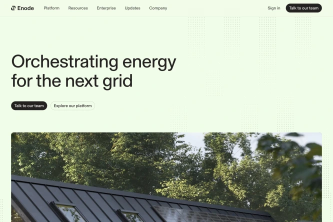
Credit: Enode. Published in Inspire on November 1, 2026. Existing preview inspected on November 2; the original site may change after capture.
The Enode homepage places dark text on a very pale green opening area. The photograph beneath introduces much deeper greens, gray architecture and bright areas of sky. The image adds variation without making the surrounding page another saturated competing surface.
The relationship worth studying is the step from a low-intensity field to a more detailed image. Dark lettering remains the strongest flat element in the opening text area; the larger photograph carries texture and a broader tonal range below.
For a SaaS website with editorial photography, compare several realistic images against the proposed field. A tint chosen beside one carefully selected picture may behave differently beside a warm office scene, a white product image or a customer's portrait.
A useful adaptation question: Does the surrounding color connect the image to the page while leaving the introduction readable? Keep this question separate from claims that green automatically communicates sustainability or trust. The screenshot cannot establish that audience response.
OpenSEO: concentrate the blue against a dark surround
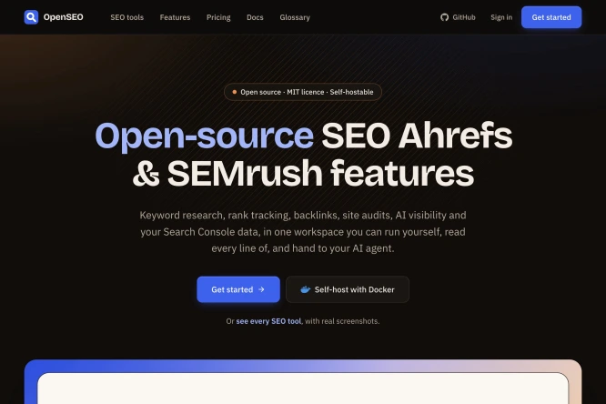
Credit: OpenSEO. Published in Inspire on November 2, 2026. Existing preview; no account, paid-data request or product setup was tested for this color comparison.
The OpenSEO page uses a dark surrounding field, a blue-to-light treatment within the main heading and a small blue primary control. The product panel beginning at the bottom introduces a much lighter area enclosed by a colored surround.
Blue therefore appears at several scales: a small control, part of the headline and an edge around a larger light surface. Those are visible connections across the composition, rather than a page filled uniformly with its most saturated color.
Compare the supporting text with the main heading. A quieter color can establish a clear difference in emphasis, but a screenshot is not enough to certify its readability. Actual text styles and their underlying backgrounds need inspection before adopting a similar treatment.
For a founder considering a dark website around a light application, this example offers a specific question: should the interface enter as a distinct panel, or should it share the surrounding field? The answer depends on what the product image needs to show, not on an assumption that dark websites are inherently more technical.
Square Kiosk: use a strong field around a physical object
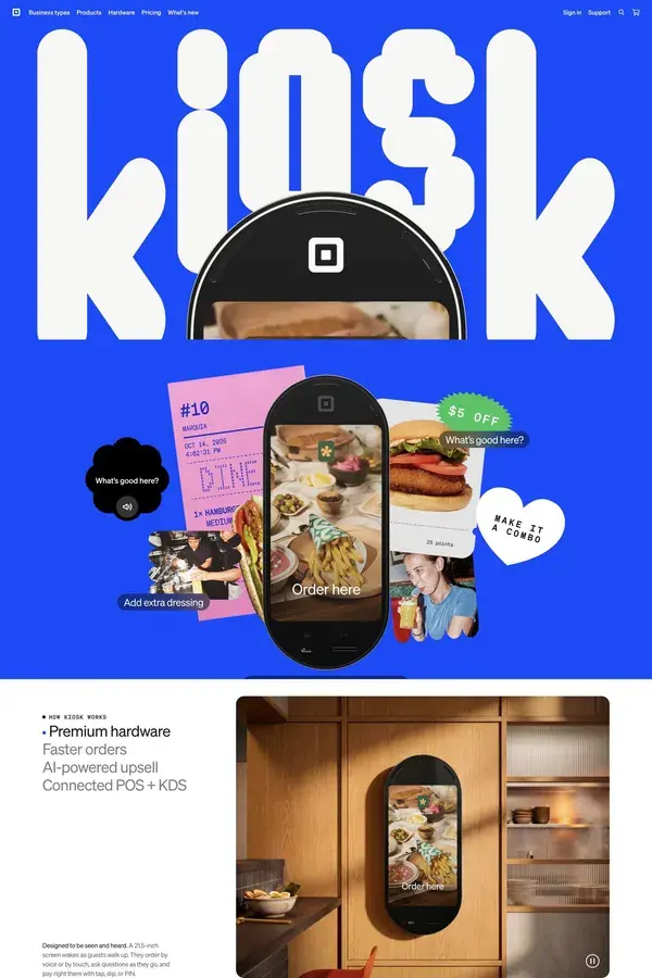
Credit: Square. Published in Inspire on October 27, 2026. Earlier captured US product-page state; check the original destination for current content and purchasing conditions.
The Square Kiosk product page is represented by a strongly saturated blue opening area, enormous white lettering and dark hardware. Food images and smaller colored elements add detail within that larger frame.
The lower white section matters to the comparison. It shows that the opening color does not have to remain the background for every subsequent explanation. A clear boundary can change the reading condition while the product continues to connect the sections.
For software, do not assume a cropped interface can perform the same job as the physical kiosk. A hardware silhouette remains recognisable at a large scale; a dense interface may become an unreadable rectangle when treated similarly.
Try the reference relationship with your actual material: a strong surrounding field, one recognisable object and a transition into a quieter explanation. If the object no longer explains anything at the intended size, revise the demonstration before deciding the color is wrong.
Fernand: reveal the product through a gradual background change
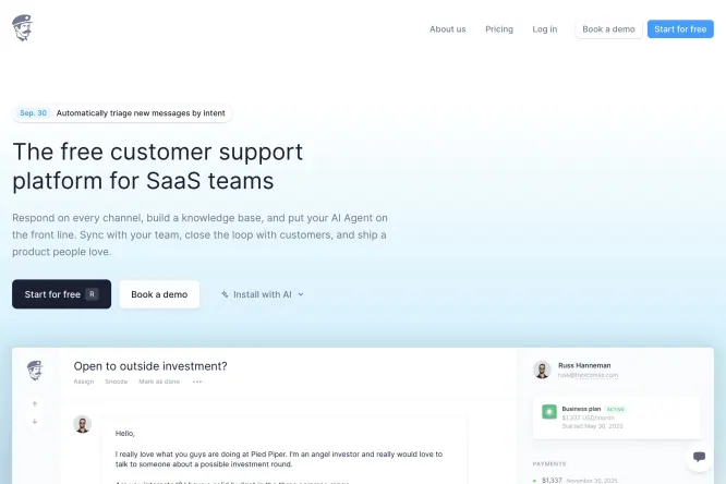
Credit: Fernand. Published in Inspire on October 24, 2026. Existing preview; interface content represents the public website's demonstration, not our signed-in product test.
The Fernand website is represented by an opening area that moves from white toward pale blue as the product panel enters. Dark text and small blue details remain visible within a composition that is mostly light.
Unlike Square's abrupt blue-to-white boundary, this transition is gradual. The white conversation panel becomes easier to distinguish where its surrounding field is more colored. The background is doing spatial work around the product image.
That is a useful comparison for SaaS teams whose application screenshots are largely white. Adding a pale field can reveal the edge without introducing a heavy frame. However, the relevant question is whether that separation survives the actual screenshot size and crop.
Inspect the full panel boundary on mobile, especially where white fades into white. A subtle edge that looks sufficient in a large desktop composition may become unclear in a narrow crop. This is a proposed check for your adaptation; no mobile or accessibility result is claimed for the original.
Emotion Agency: compare light and dark inside one hue family
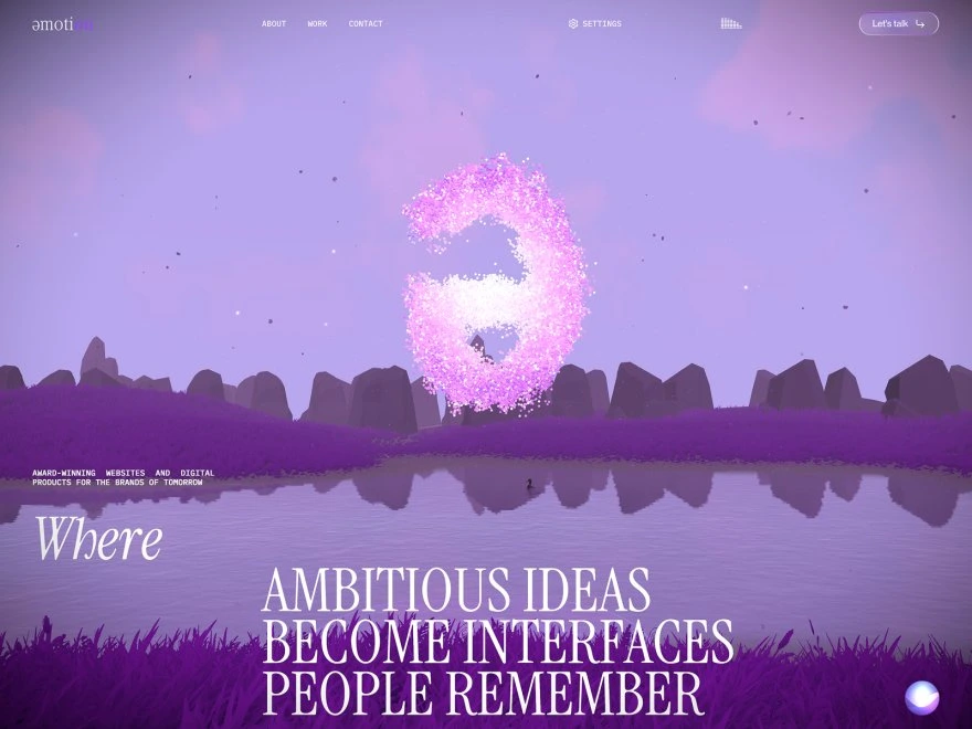
Credit: Emotion Agency. Published in Inspire on November 2, 2026. Existing captured visual state; motion, sound, loading performance and changing contrast were not tested here.
The Emotion Agency site presents a scene dominated by related purple tones. A pale upper field, dark foreground, reflective water and glowing particle form create variation without requiring a completely different flat color for each region.
The distinction to study is variation in lightness within the larger scene. The purple label alone would miss why the foreground separates from the sky, or why a bright object stands apart from its surroundings.
This is a reference for atmosphere, rather than proof that an immersive scene suits every software explanation. A SaaS product with complex technical material may need a quieter reading area even if it uses a related color direction elsewhere.
If your proposed design includes motion, inspect every relevant background behind the text. A still image cannot establish what happens when a bright object moves underneath a heading. Keep the observation about this captured composition separate from a claim about the whole animated experience.
Made You Look: let a broad gradient carry the opening field
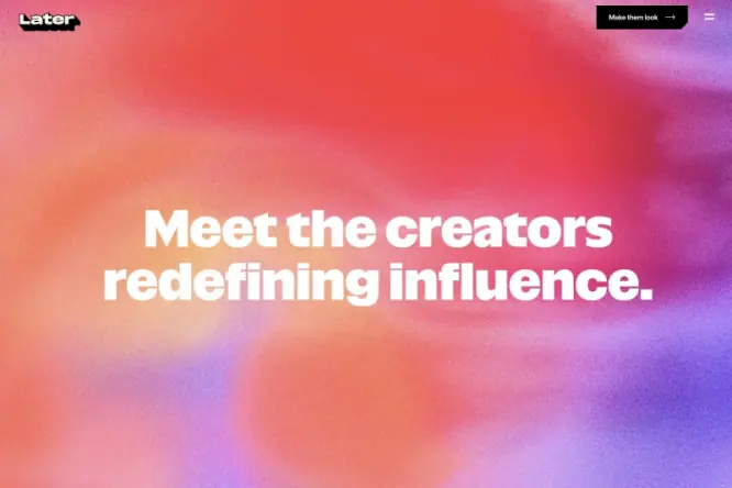
Credit: Later and the credited campaign creators. Published in Inspire on October 28, 2026. The original campaign credits production to Later, direction to Betsy Field, photography to Joe Perri and film to Frankie Cavalcanti.
The Made You Look campaign is represented by a soft, textured field moving between coral, red and purple. A large white headline occupies the central region, while a small dark control appears near the top edge.
The field contains substantial variation rather than one flat background color. That makes the location of the text part of the scheme: the same white letters would encounter different local backgrounds if the headline moved or wrapped differently.
For an expressive launch section, compare the gradient with the actual longest headline and narrowest expected layout. The reference may suggest a direction, but it does not provide a reusable contrast certificate or a universal set of exact stops.
The original campaign contains creator stories and broader service context. This comparison is limited to its captured color composition; it does not adopt the campaign's performance or return claims as independently verified findings.
Patterns worth adapting
Similar hues can organise a page differently
Square and Fernand make a useful paired comparison. Both captured pages prominently involve blue, but one uses a large saturated field around a physical product while the other gradually introduces a pale field around a mostly white interface.
The choice is more specific than bold versus calm. It concerns the relationship between the background and the thing being explained. Record that relationship in a design brief before discussing which swatch is preferable.
Enode provides another contrast: its photograph supplies much of the visual variation. Emotion's scene makes that variation part of an immersive environment. In both cases, a background-only palette would leave out important material.
A screenshot cannot supply reliable implementation values
Compressed previews, gradients, transparency and image processing can all affect a sampled pixel. A sampled value can help investigate a visual reference, but it should not be presented as an official brand token without a first-party specification.
This guide therefore describes the visible colors without inventing exact brand hex codes. A team's own implementation needs explicit values for its actual backgrounds and text, followed by checks of those combinations in context.
Use W3C's contrast guidance for the relevant text requirement: WCAG 2.2 SC 1.4.3 generally requires at least 4.5:1 for ordinary text and 3:1 for qualifying large text, with defined exceptions. A single threshold for every pair of colors would misstate the criterion.
Adaptation checklist
Compare the same content in two compositions
The original board below proposes an exercise for a fictional product called Northstar Reports. It compares a distinct background boundary with a gradual transition while keeping the product content fixed. These are invented layouts, not reconstructions of the six websites.
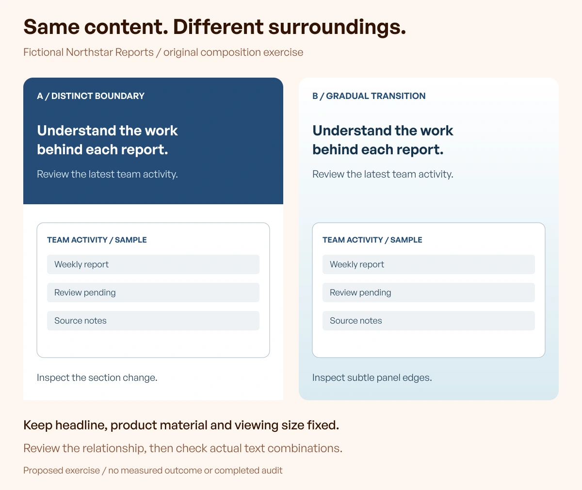
Original teaching graphic by Upslide Design Studio. Proposed comparison only; no participant study, conversion test or accessibility certification was conducted.
Begin with the actual content your page needs: one accurate headline, an explanatory sentence and a representative report image. Place that same material into two deliberately different compositions.
In the first, use a stronger opening field followed by a clear section boundary. In the second, introduce a pale field gradually behind the report. Keep the text and image content unchanged so the review concerns the composition rather than two different product stories.
Ask a relevant reviewer to identify the product image, describe its relationship to the surrounding section and read the important text at the intended viewing size. Record the observed difficulty rather than assigning a subjective modernity score.
Write the conditions alongside the direction
| Decision | What to record | What still needs verification |
|---|---|---|
| Main field | Where it begins, ends or changes | All responsive crops and content lengths |
| Product material | Actual image and display size | Legibility and representative content |
| Text placement | Which background sits behind each line | Actual computed foreground/background combinations |
| Photography or motion | The material that changes the field | Other images and relevant animation states |
| Semantic information | Labels and indicators beyond hue | Meaning remains available without recognizing the color |
W3C's Use of Color explanation states that color must not be the only visual means of conveying information or indicating an action. If your adaptation includes a success state or a chart legend, retain useful text or other appropriate distinctions rather than assuming that different hues explain the meaning.
Choose tools for the next investigation
Resource Box already includes Coolors for exploring combinations, Adobe Color for color exploration and WebAIM's Contrast Checker for checking specified foreground/background values. They answer different parts of the task; none makes copying a reference website's identity necessary.
Open the original destinations and check the relevant workflow before selecting one. This is not a subscription comparison, a claim that a particular free plan includes every function, or a guarantee of whole-page accessibility.
For help learning the underlying interface-design practices, Upslide's free UI/UX course provides a structured place to practise. The reference review remains useful whether the final page is built internally or with a design partner.
Frequently asked questions
What is a useful website color scheme example?
A useful example makes a relationship visible: color surrounding a product image, a transition between sections or text placed over a particular field. Record that relationship with the screenshot. A list of attractive swatches does not show how a page distributes them.
Can I use the exact colors from a reference website?
First distinguish visual investigation from adopting another company's identity. This guide does not grant permission to reuse brand material. Screenshot samples also are not authoritative brand specifications. Develop values for your own context and check their actual combinations rather than treating a sampled pixel as a finished design decision.
Is a blue website always suitable for SaaS?
The examples show different ways blue can appear, from a strong product stage to a gradual pale field. Suitability depends on the content, surrounding material and intended reading conditions. The presence of blue alone does not establish trust, usability or a business result.
Should every section have the same background color?
Not necessarily. A continuous field and a deliberate section boundary can each be useful. Compare how the actual content moves between areas, including product previews and long explanations. The Square and Fernand references illustrate different visible transitions rather than a rule that one arrangement always wins.
Can a gradient pass an accessibility check?
The relevant text and interface requirements still apply. Inspect the actual background under the content, including responsive and changing states. A few sampled stops do not establish that every text location is sufficient, and this collection does not certify any featured gradient.
How should new Inspire picks change this article?
They become review candidates. Keep at least six published, attributable references whose inspected previews support a meaningful color comparison. Preserve edition dates, verify the original destination and explain what the new example adds. Replace an unsuitable reference or hold the update instead of adding every newly published website automatically.
Key takeaways
- Compare the space a color occupies and the material beside it.
- Keep photographs, product images and transitions inside the analysis.
- Describe observed composition without inventing official color specifications.
- Check actual text combinations and non-color meaning in your own implementation.
- Use new references to answer a specific unresolved question.
Choose two examples with meaningfully different relationships, then compare the same content in both directions. Continue through Inspire's published references for another comparison or Resource Box for a tool to investigate it.