
How do you choose an icon library when every homepage looks consistent, but your product needs more than search, home and settings? The useful comparison starts with the concepts the product must communicate, the states it must represent and the files the team will maintain.
A SaaS founder needs a dependable source that fits the product's scope. A designer needs a family whose geometry, variants and delivery formats can survive the move from a polished sample screen into the rest of the interface.
This guide compares seven libraries through official documentation and attributed previews. It adds an original coverage worksheet for a fictional subscription product; the worksheet is a proposed evaluation method, not a claim that each library has been installed, exhaustively counted or tested with users.
Design task
Choose a source the product can maintain
An icon library is a collection with shared design conventions and a way to obtain its assets. Choosing it creates an ongoing dependency: product vocabulary becomes associated with particular drawings, names and versions.
A team that selects individual icons without preserving those associations can later struggle to replace a missing symbol or reproduce a state. The selection brief should therefore cover the product's immediate needs and its expected next area of work.
Start with these questions:
- Which destinations, actions and statuses need symbols?
- Which concepts can be expressed more clearly with text alone?
- Which symbols need related variants or specialised small-size drawings?
- Will the assets be used in design files, code, documents or several of these?
- Who will retain the source version, licence and local modifications?
The library should fit the product's vocabulary before the product adopts the library's vocabulary.
Separate visual choice from source choice
Outline, filled and duotone describe visual treatments. A library is the source that supplies particular drawings, with its own coverage, geometry, distribution and terms.
A team can prefer outlines yet still face a meaningful choice among libraries. Some support adjustable strokes; others offer separate size-specific drawings or several weights of a concept.
For the visual question, Upslide's guide to icon styles compares treatments. This article addresses which source can support the selected direction without leaving unrecorded gaps.
Set the boundaries of the comparison
The shortlist concentrates on general interface libraries already discoverable through Resource Box, plus the newly added Bootstrap Icons. It doesn't rank libraries by download counts or declare that one contains the most usable icons.
Brand marks, specialised industry diagrams and decorative illustrations require separate evaluation. A general-purpose set shouldn't be rejected solely because it doesn't supply a company's logo or an unusually specific process diagram.
Resource collection
Compare seven libraries by their selection trade-offs
The table is a starting point for evaluation, not a scored benchmark. Official pages and licences were checked on November 2, 2026; an installed version and its accompanying files should remain part of the team's own record.
| Library | Relevant documented approach | Useful reason to shortlist it | Question to resolve |
|---|---|---|---|
| Lucide | SVG-based library with official platform packages | An outline-led interface with a shared design and code source | Does the actual concept list fit the selected assets and state approach? |
| Phosphor | Six weights, including fill and duotone | A product needing related visual weights within one family | Which weights will the product allow, and where? |
| Heroicons | SVG, React and Vue; separate outline and solid size routes | A team wanting explicit small-size choices | Does its available vocabulary cover the product without excessive exceptions? |
| Tabler Icons | Outline/filled browsing with size, stroke and colour controls | A broad catalogue that can be searched against a product inventory | Is the needed concept available in the required variant? |
| Iconoir | SVG and several platform routes; regular and solid assets | A team evaluating its particular line treatment and delivery options | Does the chosen style remain coherent beside the product's typography? |
| Material Symbols | Downloadable assets and variable-font controls | A system needing configurable symbol appearance | Which delivery route and axis settings will be maintained? |
| Bootstrap Icons | SVG, sprite and web-font distribution | A team wanting those delivery options with or without Bootstrap | Which actual icons and variants belong in the shipped subset? |
Lucide: evaluate the outline family and package route
Lucide's official guide describes SVG assets and packages for several platforms. Its documentation also explains tree shaking: compatible build tooling can omit unused icons rather than requiring the entire catalogue to ship.
That makes it a candidate when design and development need to point to a shared icon source. The review still needs to identify the specific assets, intended visual states and installed package version.
Its licence page identifies ISC terms and also lists Feather-derived icons under MIT. Preserve the supplied notices instead of summarising the whole collection as “no conditions.”
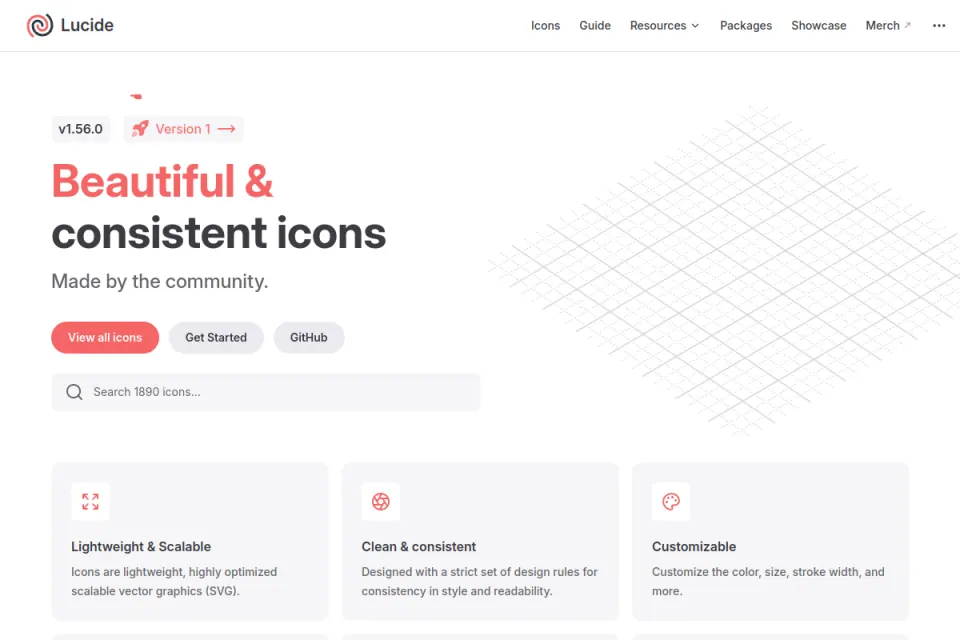
Existing Resource Box capture, visually inspected. Credit: Lucide. This introductory homepage view isn't evidence that a particular product's icon inventory is covered.
Phosphor: decide how the weights will be used
Phosphor's official overview documents Thin, Light, Regular, Bold, Fill and Duotone. Its core repository supplies SVG assets grouped by weight and catalogue metadata.
Those options are useful when the design brief calls for several related treatments. They also introduce a decision: arbitrary changes of weight across screens can undermine the consistency that a matched family is meant to provide.
A team might specify one ordinary treatment and a separate selected treatment, then verify the relationship for each required asset. The core licence is MIT; keep its notice with the corresponding distributed material.

Existing attributed brand artwork from Resource Box, inspected for this guide. Credit: Phosphor. It shows the visual identity, not a side-by-side test of all six weights.
Heroicons: use the intended size route
Heroicons supplies SVG assets and first-party React and Vue libraries. Its official repository instructions distinguish 24-size outline and solid routes from 20-size and 16-size solid routes.
This provides a concrete option for a team that wants small assets with a defined source. It doesn't mean a large variant should automatically be shrunk to every display size, or that every library must follow the same sizes.
Check the available concepts before committing to an entire product. Retain the MIT notice for the version actually used.
Existing attributed introductory artwork, visually inspected. Credit: Heroicons. The image isn't a catalogue-coverage or recognition study.
Tabler Icons: inspect the required variants
Tabler's official catalogue offers outline and filled filters alongside size, stroke and colour controls. It documents a 24-by-24 grid with a starting 2-pixel stroke and several ways to deliver the assets.
A broad catalogue can be helpful for finding candidates, but a catalogue total doesn't prove that every concept has every desired variant. Search each required concept and inspect the resulting drawing in context.
The official site separates free open-source icons from optional support or product bundles. Its icon repository licence is MIT; an optional bundle shouldn't be mistaken for a requirement to use the open-source assets.
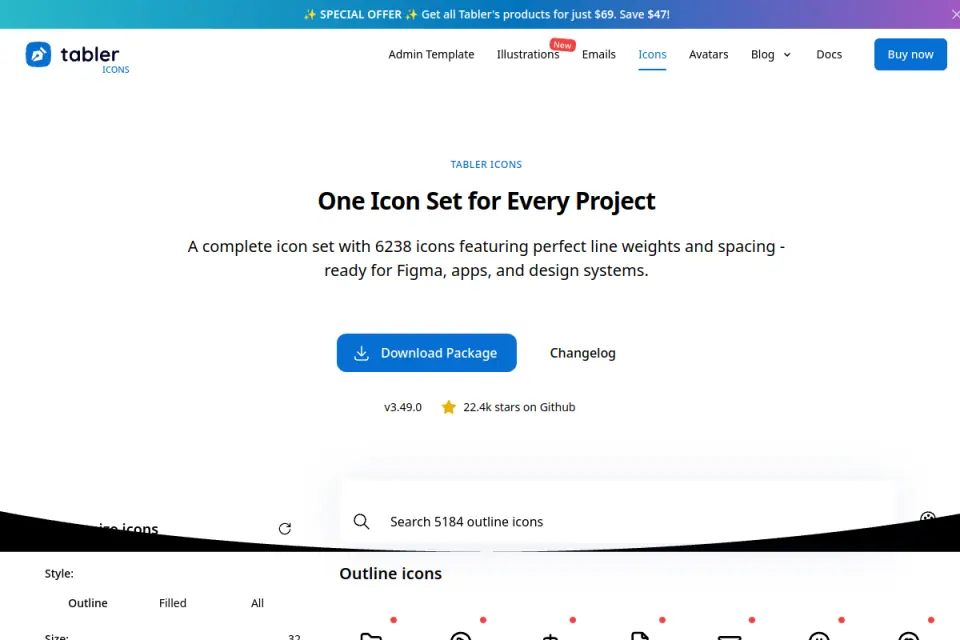
Existing public-page capture, visually inspected. Credit: Tabler. Promotional counts and offers visible in an older capture aren't current pricing evidence.
Iconoir: check the style and implementation together
Iconoir's official site presents a free MIT-licensed library and links design and development routes, including SVG, React, React Native, Flutter, Figma and Framer. Its catalogue interface exposes size and stroke controls.
The useful evaluation is whether the selected drawings fit the product's actual typography and density. A pleasing homepage treatment doesn't establish how they will read in a compact row or selected navigation item.
Record the chosen assets and platform route. The repository licence should travel with the project record and relevant distributed copies.
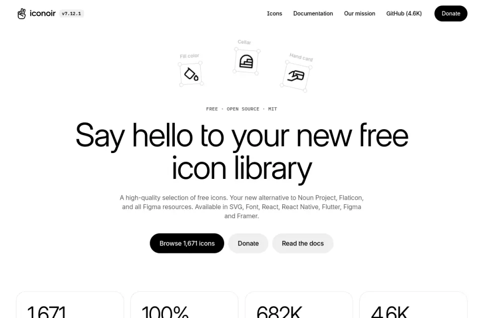
Existing public-page capture, visually inspected. Credit: Iconoir. Its presentation supplies visual context rather than a product-specific recommendation.
Material Symbols: specify the delivery and settings
Google's Material Symbols guide documents downloadable SVG and PNG assets alongside font delivery. It explains controls for fill, weight, grade and optical size.
This offers a different selection question from choosing a fixed SVG drawing: which settings should remain consistent, and how will the implementation preserve them? A font-based approach also needs review of loading behaviour and the subset actually delivered.
Google identifies Apache 2.0 licensing. The licence's redistribution conditions address included terms, retained notices and modification notices; use the actual files and conditions when preparing a handoff.
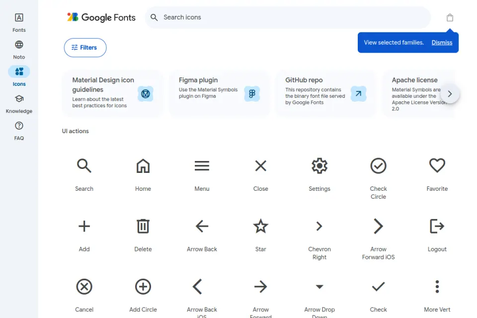
Existing public catalogue capture, visually inspected. Credit: Google Fonts / Material Symbols. Labels in the catalogue help discovery but don't automatically become accessible names inside a product.
Bootstrap Icons: consider it independently of the framework
Bootstrap Icons explicitly supports use with or without Bootstrap. The official site offers SVG, sprite and web-font routes, plus a linked Figma file.
This is a useful addition to Resource Box for teams evaluating those delivery formats. The MIT licence and the actual imported assets should be retained in the source record.
The name shouldn't decide the selection. Existing use of Bootstrap may make the source familiar, but the product's concepts, visual treatment and delivery requirements still need review.
Fit and limitations
Compare coverage by concept, not file count
A catalogue may count one concept in several styles as several files. Another may advertise distinct drawings, while an aggregator combines unrelated families under one search interface.
The team's question is narrower: can the required concepts be represented in the chosen treatment without creating ambiguous substitutions? An unavailable rare symbol may be manageable; an unclear symbol for the main workflow is a more serious gap.
Keep three outcomes separate:
- Candidate found: A plausible asset exists and has been recorded.
- Meaning unresolved: A drawing exists, but its interpretation still needs review.
- Source gap: The required concept or variant hasn't been found.
Finding an asset doesn't resolve the second outcome. A symbol named “archive” in a catalogue might still be wrong for a product action that suspends a subscription.
Compare geometry in the same environment
Different source grids, internal padding and line treatments can produce different apparent sizes inside identical containers. Record the intended display size and inspect a candidate row beside the real product text.
This is a selection check rather than a complete construction tutorial. Upslide's icon design best practices covers optical balance and clarity in more detail.
Avoid selecting a library solely because an enlarged preview looks elegant. The relevant evidence is the asset in the interface where it will be used.
How to choose
Build a product-specific coverage worksheet
Consider a fictional subscription-management product called Ledgerboard. Its designer is choosing an icon source before preparing the billing area, team settings and activity records.
The worksheet below defines the work to evaluate. It deliberately doesn't award scores to real libraries without inspecting their corresponding assets.
| Product concept | What must remain clear | Candidate evidence to record | Unresolved outcome |
|---|---|---|---|
| Subscription overview | A destination rather than a payment action | Source name, drawing and navigation label | Keep the destination label if the metaphor is uncertain |
| Upcoming invoice | A document associated with a future charge | Asset plus nearby date and status text | Don't ask the drawing alone to explain timing |
| Pause subscription | A reversible change to billing behaviour | Candidate symbol and explicit action wording | Review meaning before approval |
| Invite teammate | Adding a person to this workspace | Asset and invitation action label | Avoid confusing invitation with account creation |
| Export activity | Obtaining a file from the current records | Asset plus export wording and format choice | Confirm the action differs from sharing a link |
| Payment needs attention | A status requiring a next step | Symbol, status text and recovery action | Preserve meaning without relying on colour alone |
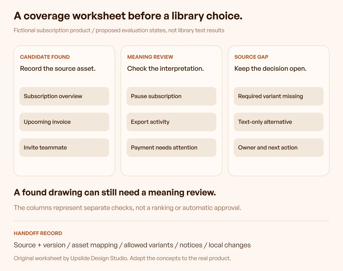
Original illustrative worksheet by Upslide. The example uses fictional evaluation states; no row reports a test result for a listed library.
Follow one uncertain row through the decision
Take “Pause subscription.” A pause-bars drawing is a candidate metaphor, but its presence in a library says nothing about whether a subscriber will understand the consequences.
The review should retain the product's explicit wording, show the relevant subscription context and explain when the pause takes effect. A participant can then be asked what will happen before activating the control.
If the interpretation is wrong, the response may be clearer text or a revised action design. Searching for a more decorative pause icon wouldn't necessarily address the underlying uncertainty.
For source selection, the team records whether a suitable candidate exists and whether it fits the chosen family. For usability, it records what people understood; these are different pieces of evidence.
Decide using acceptance conditions
A small team can evaluate two shortlisted libraries against the same worksheet. Keep screenshots of the candidate assets and record the source names rather than relying on memory after browsing.
Suggested acceptance conditions are:
- Every essential concept has an acceptable candidate or an explicit text-only decision.
- Required variants are available or a consistent alternative is documented.
- Sample assets fit the intended display environment without unexplained exceptions.
- Design and code can reference the same source and version.
- Licence records and any modifications have an owner.
- Unresolved meaning questions remain visible until reviewed.
These are proposed project conditions, not a universal certification. A failed essential condition can outweigh several minor advantages elsewhere.
Preserve the decision in the handoff
The final record should include the library, installed or downloaded version, source URL, chosen asset names, allowed variants and local changes. Include the licence material appropriate to those files.
Where design and implementation names differ, retain a mapping. A product-facing concept such as “Invite teammate” shouldn't silently change meaning because a package calls the selected drawing something else.
Link the icon decision to the UI kit and component-library selection when the two are part of the same prototype. An icon package can supply drawings; component behaviour still needs its own specification.
Continue in Resource Box and Inspire
Move from the shortlist to the source
Use Resource Box to open the original library destinations and retain a manageable shortlist. The directory helps discovery; the official source and downloaded version remain responsible for current availability and terms.
New resources should trigger a review when they address a real gap in an existing worksheet. Adding a new library doesn't automatically justify replacing a complete, coherent system.
Study presentation without inferring the source
Use Daily Inspire to study how real websites combine symbols, text and surrounding space. Follow through to the original site and credit its creator when recording a reference.
A screenshot rarely proves which icon package a site uses. Keep an observation such as “the symbol reinforces the label” separate from an unverified claim about the underlying library.
This guide doesn't depend on a particular daily edition. A later reference can support the presentation discussion if it adds a concrete inspected lesson, without changing the library's documented capabilities.
Frequently asked questions
Which icon library is best for a small SaaS product?
The strongest candidate is the one that meets the product's essential concepts, state needs and delivery requirements with the fewest unexplained exceptions. Build a short inventory first, then compare candidates against it instead of selecting solely by popularity.
Is an icon library with more files always more complete?
No. File counts may include repeated concepts across weights or styles, and aggregators may combine unrelated families. Compare the distinct product concepts and required variants directly.
Can free icons be used in a commercial product?
Read the licence supplied with the chosen files and version. The shortlist includes MIT, ISC and Apache 2.0 sources, but permitted use still comes with conditions such as retaining notices; a “free” label isn't a substitute for that record.
Can two libraries be used in the same interface?
They can be evaluated together when a genuine coverage need exists. Document the exception and inspect the combined result, because matching nominal dimensions doesn't guarantee matching visual weight or geometry.
Does using Heroicons require Tailwind CSS?
The official repository supplies basic SVG usage and first-party React and Vue packages. The drawings can be evaluated on their own; the product's styling system and asset coverage still determine whether they fit.
Should a team choose SVG assets or an icon font?
Choose based on the implementation and review the actual delivery. Individual SVGs make asset selection explicit, while a font route introduces its own settings, loading and subsetting decisions; neither format automatically supplies accessible control names.
Does an icon's catalogue label make the product accessible?
No. The interface must communicate the action or status in its own context. Lucide's accessibility guidance distinguishes decorative symbols from meaningful controls and explains why a control needs an appropriate accessible name.
When should an existing library choice be reviewed?
Review it when a new feature exposes important coverage gaps, the delivery platform changes, an update changes relevant assets or terms, or product research finds unclear meanings. A new catalogue release alone doesn't require a migration.
Key takeaways
- Start with product concepts, required variants and delivery constraints.
- Compare candidate assets using a consistent worksheet, not incompatible catalogue totals.
- Treat finding a drawing and verifying its meaning as separate decisions.
- Retain source versions, asset mappings, terms and modifications in the handoff.
- Use Resource Box for discovery and Inspire for presentation references, with original-source attribution.
We help SaaS teams connect visual decisions to clearer product workflows. If the icon review exposes a wider navigation or action-design problem, talk to Upslide about the design work.