
When you save a navigation design example, can you explain why its links belong together, or are you mainly saving the panel's appearance?
A menu can look orderly while mixing products, audiences and account actions without explaining the distinction. The useful reference records what opens, what the choices describe and which destination each choice represents.
This guide compares six websites already present in published Inspire editions. Their current desktop headers were inspected separately from the original gallery previews, including expanded groups and one followed destination. The collection concerns navigation structure, rather than a ranking of conversion performance or a complete accessibility assessment.
Save the relationship between a label and its destination, along with the layout.
Design problem
Identify the question the menu helps answer
A visitor asking what a platform contains needs a different grouping from someone asking whether it suits their role. A returning customer looking for account access needs another route again.
Those questions can coexist in one header, but they should remain identifiable. Product categories, audience groups and utility controls aren't interchangeable just because each can be represented by a short link.
Before choosing a reference, write down the intended visitor, the information they need and the destination that can provide it. This creates a concrete comparison instead of a contest between large and small menus.
Record a disclosure separately from a destination
Opening a menu reveals choices. Following a link changes the location or starts another operation. A review should distinguish those actions, including when a parent category has its own overview page.
The examples below were inspected at a 1466 by 856 CSS-pixel desktop viewport. Some disclosures were opened through the browser's exposed Expand action after an initial click left them collapsed; that is recorded operation, not evidence of a complete keyboard or pointer interaction test.
The selected captures establish visible menu states and exposed links. They don't establish every destination's contents, mobile behavior, focus handling, hover timing or behavior in a signed-in application.
Example collection
Compare the basis of the grouping
| Published Inspire reference | Observed header state | Basis worth studying |
|---|---|---|
| Enode, November 1 edition | Platform group expanded | An overview beside named platform capabilities |
| Gumloop, October 31 archive | Solutions group expanded | Roles distinguished from use cases |
| Square Kiosk, October 27 archive | Products, then Hardware expanded | A product family leading to specific models |
| Thrad, October 27 archive | Advertise group expanded | Audiences separated from buying modes and product information |
| OMMAGE, November 2 edition | Shop group expanded | A small named-product collection with separate utility routes |
| Fernand, October 24 archive | Direct header links; About us followed | A compact header without an invented category disclosure |
Edition dates identify the published Inspire references. Several are retrospective archive labels, not asserted website launch dates or exact publication timestamps. The images in this article are the separately inspected current-original captures from November 3, 2026 IST; they can differ from the gallery's earlier previews.
Enode: distinguish an overview from specific capabilities
The inspected Enode header places Platform alongside Resources, Enterprise, Updates and Company. Opening Platform reveals four linked cards: Overview, Asset connectivity, Home energy coordination and Residential flexibility.
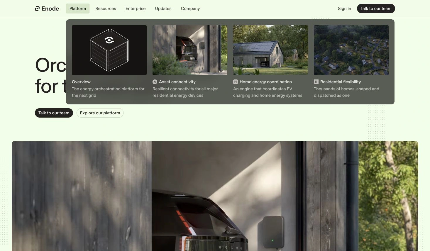
Credit: Enode. Actual original-page capture, November 3 IST, tied to its November 1 Inspire reference. Expanded desktop presentation inspected; the four destinations weren't all followed.
The overview is useful to distinguish from the more specific capability routes. A team adapting this relationship should decide what the general explanation covers and what additional detail belongs to each named destination.
Each card also carries an image and a short description. The text supplies context that the image alone cannot establish; it should be evaluated with the real category name rather than replaced with decorative artwork and an ambiguous label.
For a SaaS founder, the practical question is whether the product can support this depth of explanation. A menu with four carefully styled cards still needs four maintained destinations, or an intentional explanation of which routes share a page.
The observation concerns the disclosed structure. Enode's scale, customer and operational statements elsewhere on the page aren't independent evidence for this design choice and aren't adopted as results here.
Gumloop: give different category systems their own headings
The current Gumloop Solutions menu separates Roles from Use cases. Role links include Marketing, Sales, Operations, Engineering, Support and Security; the neighboring area names activities such as meeting preparation and lead qualification.
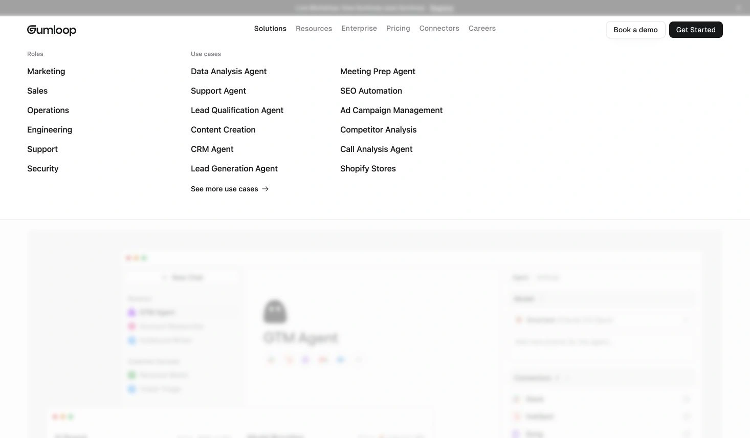
Credit: Gumloop. Actual expanded original-page capture, November 3 IST; October 31 Inspire archive reference. The image shows the current menu, not a tested agent workflow.
This is a useful distinction between who someone is and what they want to do. A marketing team might investigate several activities, while a particular activity can matter to more than one role.
The headings make those two entry systems visible together. They don't prove that visitors understand the categories, that the destination material is complete or that every role receives a different implemented product.
For an adaptation, keep a route inventory behind the visual menu. Record whether a role page explains that audience's context, whether an activity page shows a specific task and who maintains each page when the offer changes.
Don't multiply destinations merely to fill the panel. If two proposed links lead to the same undifferentiated explanation, the content decision needs attention before the layout acquires another column.
Square: preserve the parent category while exposing specific choices
On the inspected Square Kiosk page, Products opens a broader product grouping. Expanding Hardware within it reveals named models and routes such as accessories, kits and the complete hardware collection.
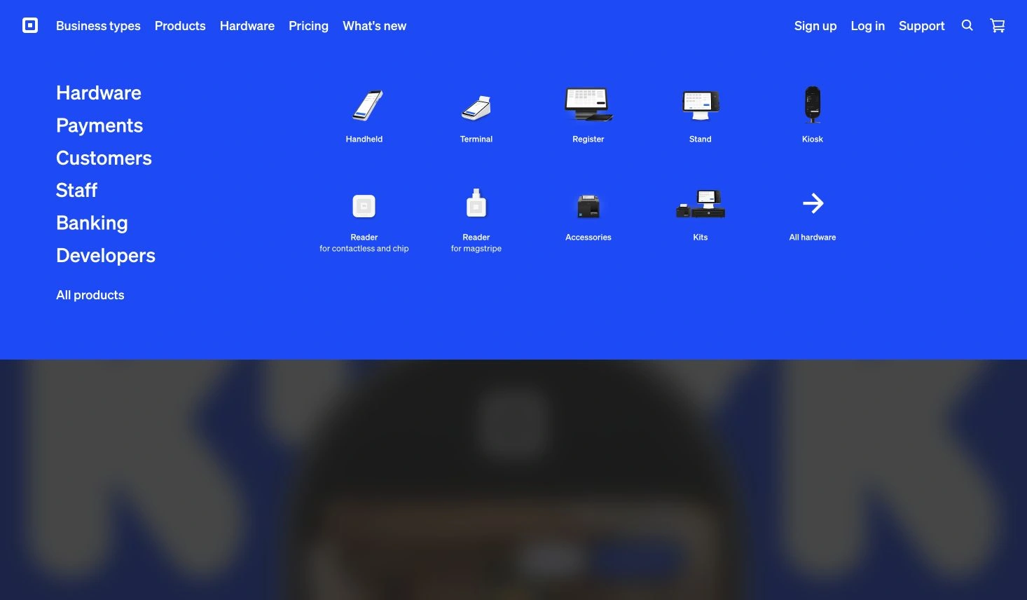
Credit: Square; actual original-page capture, November 3 IST, tied to the October 27 Inspire archive reference. Products and Hardware were expanded; no purchase, checkout or compatibility evaluation was performed.
The distinction is between a family and an item within that family. The left-side categories remain visible while the right side provides more specific destinations, so the captured state preserves both levels of context.
A software team can use that relationship when a broad platform contains several substantial areas. It should first check whether the content really needs another level, rather than introducing nested categories to make a small offering look larger.
The complete-collection route also deserves an explicit decision. It can provide a different browsing destination from a single model, but its existence doesn't establish that every comparison or selection task has been solved.
The source is the US product destination. The menu observation doesn't establish availability, pricing or an identical navigation structure in other markets.
Thrad: separate audience from how the service is bought
The inspected Thrad Advertise group exposes audience links for brands, agencies and DSPs. A separate How you buy area distinguishes Self-Serve from Managed Service, with other areas for product information and a platform route.
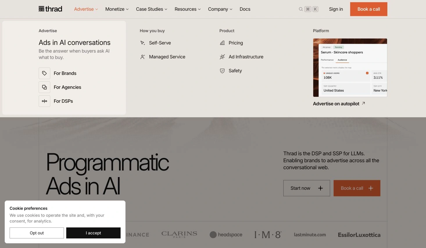
Credit: Thrad; actual original-page capture, November 3 IST, tied to the October 27 Inspire archive reference. The cookie notice remained visible below the menu; no advertising account or campaign was operated.
Audience and buying mode answer different questions. A company can belong to an audience category while still needing to choose how it engages with the service, so the group names shouldn't be collapsed into one unlabelled list.
For an adaptation, write the distinction beside each proposed destination. The team should be able to explain what a person learns from an audience page that isn't already supplied by a buying-mode page.
This is structural analysis of the public menu. It doesn't verify the availability of a commercial offering, the platform's advertising claims or the sample figures visible in its promotional interface card.
OMMAGE: keep a small product set distinct from utility controls
Opening Shop on the current OMMAGE website reveals three named product destinations: First Base, Lip Coat and Buffer Brush. About and World remain separate header routes, while account and bag controls sit on the other side of the identity.
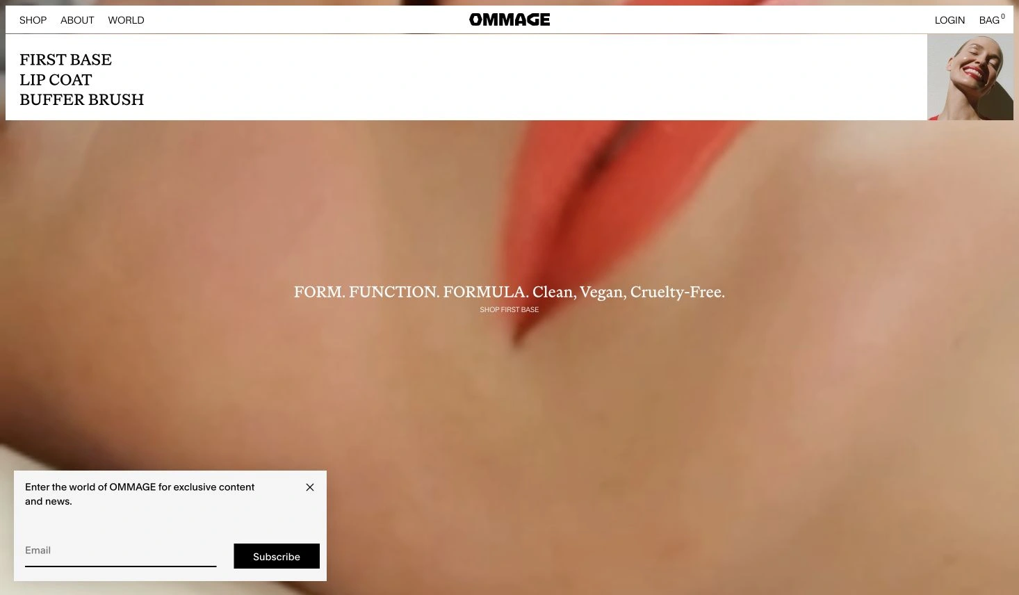
Credit: OMMAGE and the credited artwork creators. Actual original-page capture, November 3 IST; November 2 Inspire reference. The newsletter overlay below the menu is part of the capture, not evidence of a completed subscription.
The product collection is relatively small in this state. That makes it a useful counterpoint to Square's more extensive hierarchy, without establishing that fewer links are always better.
The surrounding utility routes also carry a different purpose from product browsing. A SaaS equivalent might separate documentation or account access from the collection a new visitor is exploring.
Adapt the relationship, not the product names or brand identity. The reference doesn't grant permission to reuse its imagery, and the inspected menu doesn't establish checkout, stock or account behavior.
Fernand: study a direct route without inventing a hidden menu
The inspected Fernand header exposes About us and Pricing alongside Log in, Book a demo and Start for free. This captured header doesn't require a large product-category panel to make those routes visible.
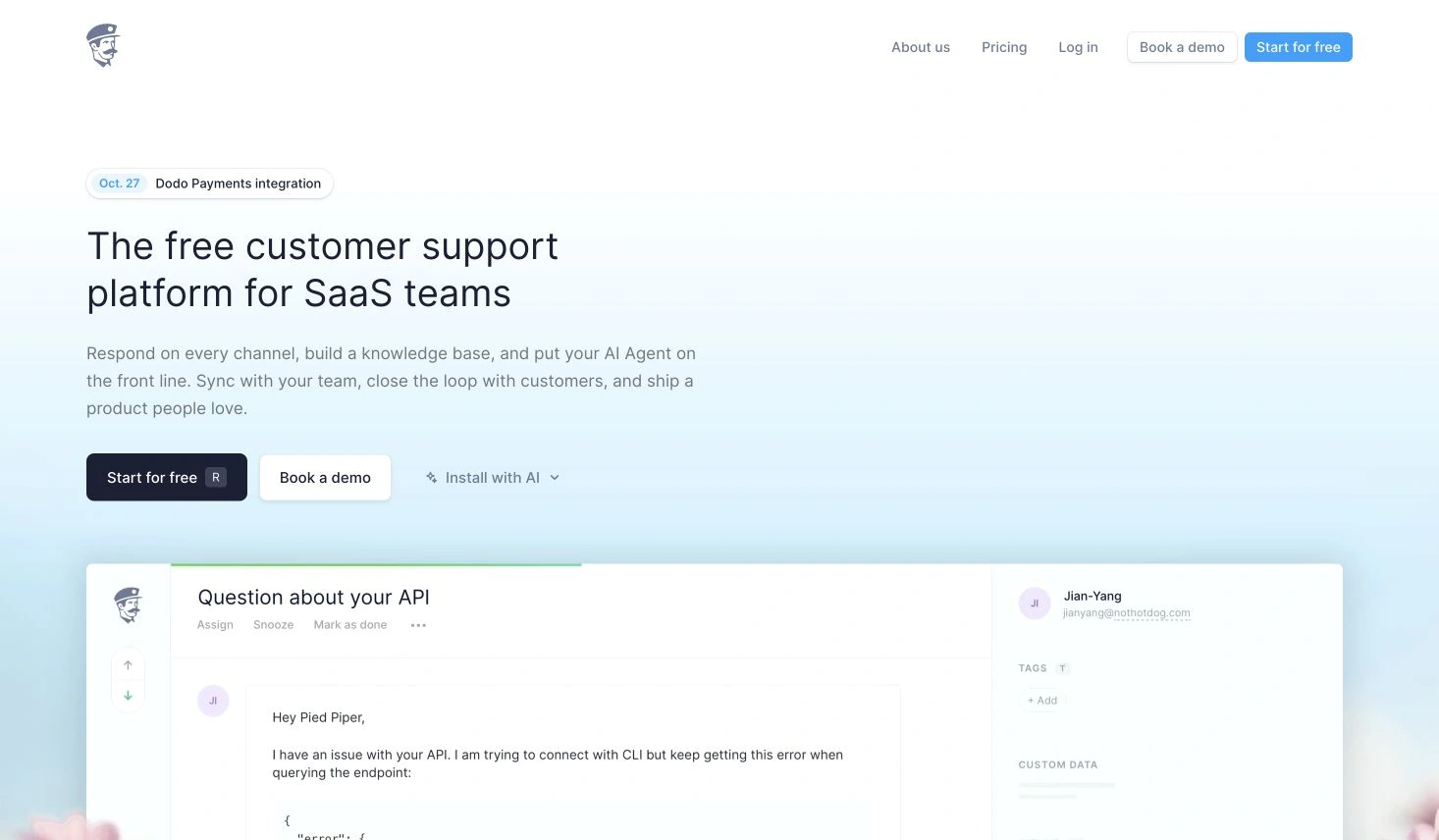
Credit: Fernand. Actual original-page capture, November 3 IST; October 24 Inspire archive reference. About us was followed and its philosophy page appeared; no account, demo booking or signup was completed.
Following About us reached a page with the heading Our philosophy. That supports one specific label-to-destination observation. It doesn't establish the clarity or success of every other route in the header.
For a team with a compact public content set, the useful question is whether direct links supply enough orientation. Adding a large menu can introduce another decision without creating any additional material worth finding.
Keep the categories of action explicit in the handoff. Reading about a company, entering an existing account, requesting a conversation and starting a new account aren't equivalent operations merely because they share a horizontal row.
Patterns worth adapting
Name the grouping rule
Across these examples, the most useful comparison is the basis of each group: capability, role, activity, product family, audience or buying mode. Record that basis before borrowing its shape.
A mixed menu can still be intentional. The problem is leaving the distinction unexplained when both the content and the label need it. Headings and descriptions are working parts of that explanation, not filler for a large panel.
Keep disclosure depth connected to content depth
Square's expanded product family and OMMAGE's short product list support different amounts of visible hierarchy. Neither supplies a universal rule for the number of levels a website should contain.
Write down the parent, the exposed choices and any overview route together. Then check whether the underlying content supports those distinctions. More elaborate navigation is not a substitute for a clearer content inventory.
Treat usability claims as a separate evidence question
The examples expose real arrangements, but this collection didn't measure task completion or compare visitors under controlled conditions. Observed menu expansion doesn't establish discoverability, and exposed links don't prove that people interpret their names correctly.
NN/G's menu-design checklist discusses visibility, location, labels and manipulation as separate concerns. Those are useful review questions; the six captures here don't provide complete findings for each one.
Adaptation checklist
Build a small destination contract before styling the panel
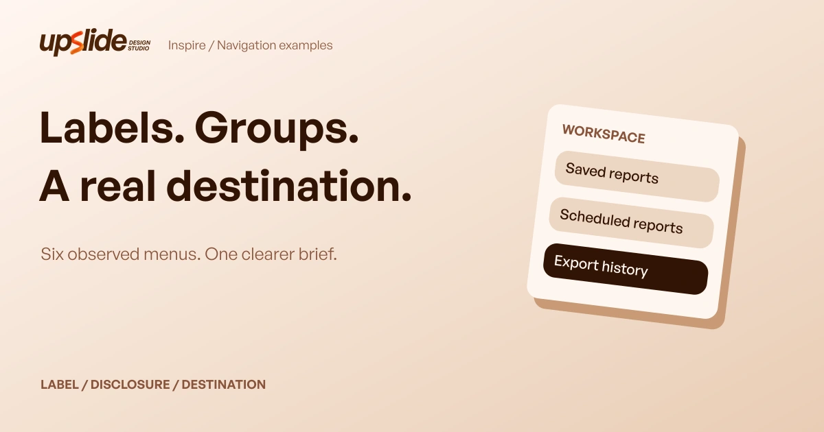
For an original fictional reporting workspace, we defined three destination records: a saved-report list, scheduled report runs and export history. Each has a named purpose and an owning team in the planning data.
The first menu draft contains two sibling links both called Reports, but they point to different records. A third link called Archive points to a target that the declared destination catalogue doesn't contain.
Our executed local check flags two structural problems: one duplicate sibling label and one unknown target reference. It checks declared names and identifiers only; it doesn't request web pages or assess whether a visitor understands the wording.
| Item | Initial label and target | Revised label and target |
|---|---|---|
| N01 | Reports → report-list | Saved reports → report-list |
| N02 | Reports → schedule-list | Scheduled reports → schedule-list |
| N03 | Archive → unknown archive target | Export history → export-history |
The revised data has three distinct sibling labels and three references present in the catalogue, so the same local check reports zero problems. The labels remain proposed language, not experimentally validated wording.
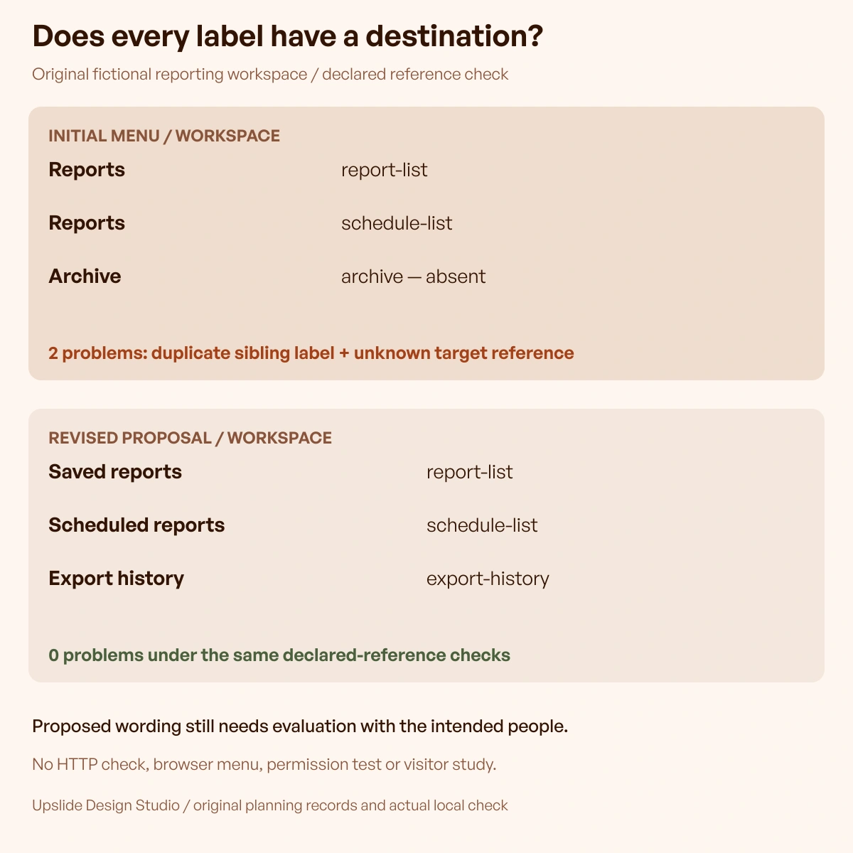
Original Upslide planning data and executed reference check. Two declared structural problems become zero; no live website, visitor study or accessibility result is represented.
Review the next destination as well as the menu state
Keep a destination's purpose, content owner and unresolved requirements with its label. A structurally valid reference can still lead to unfinished material, an inappropriate request or a page whose title doesn't match the invitation.
Next review the actual implementation: opening and closing, direct-link behavior, return context and relevant input methods. These are future checks for the fictional proposal, not outcomes demonstrated by its JSON records.
Keep references and production resources connected
Resource Box includes existing design and prototyping routes such as Figma and Penpot for developing an original navigation proposal. Choose the working environment around the team's actual file and implementation needs; this article doesn't claim the featured websites used either tool.
The published UI-kit and component-library guide helps distinguish design assets from implemented interaction foundations. A menu drawn in a design file still needs the relevant behavior and destination work.
Update the collection when a new source adds a meaningful contrast
New daily Inspire picks should enter a source review, not automatically become another example. Preserve at least six qualified published references, their exact pick identities, original destinations, credits and inspected states.
If a current menu changes, revise the affected observation or inspect a suitable replacement. Keep the original edition label distinct from a new capture date, and hold an update that would leave the collection below its qualified-source minimum.
Frequently asked questions
What should a navigation design reference record?
Record the visible label, the grouping basis, the action that exposes its choices and the destination represented by each link. Include the source and capture context so a later reviewer can distinguish an observed state from an assumed behavior.
Should a website group links by role or by task?
The choice depends on what the destination material explains. Gumloop's observed menu makes both bases visible under different headings. That arrangement is a reference for comparison, not evidence that every product needs both systems.
Does opening a menu prove its links are easy to discover?
It proves that the inspected state was reached through the recorded operation. Discoverability and comprehension require suitable evaluation with the intended people and conditions; they weren't measured in this collection.
Is a compact header always better than a larger menu?
Compare the content relationships and the visitor's question first. A compact set can expose direct routes, while a broader offering may need meaningful groups. Link count alone doesn't establish whether the navigation works.
Can the original destination check validate a real website?
It checks duplicate declared sibling labels and references to a small fictional catalogue. It doesn't crawl a site, verify HTTP responses, evaluate permissions or test a visitor's understanding. Those require additional implementation evidence.
Were these examples tested on mobile or with assistive technology?
No. The captured observations concern the declared desktop viewport and selected exposed controls. Responsive layouts, keyboard paths, screen readers and other input conditions remain separate review work.
How should new Inspire picks change this guide?
Review their actual source and navigation task fit before adding them. Keep meaningful contrasts, creator context and the six-source minimum rather than expanding the article solely because another attractive header was published.
Key takeaways
- Save the grouping rule and destination relationship alongside a menu's appearance.
- Distinguish capabilities, audiences, activities and utility routes.
- Keep a disclosed state separate from a followed destination and a completed task.
- Review the actual implementation beyond a structurally consistent planning record.
- Preserve published source identities and dated observations as examples change.
In our free design course, we teach designers to connect interface choices with a reviewable task. Bring one real navigation question and the destinations it needs to explain.